
Between Us is a fictional artisanal café created as a semester-long brand identity project. The goal: build a full visual system from scratch, including logos, color, packaging, print collateral, digital ads, and a full brand guide. Inspired by the bond between a mother and her son, the project blends warmth, modern minimalism, and community storytelling.
Primary branding elements for Between Us Café. The tone is warm, modern, and rooted in storytelling.
Brand Guideline Booklet
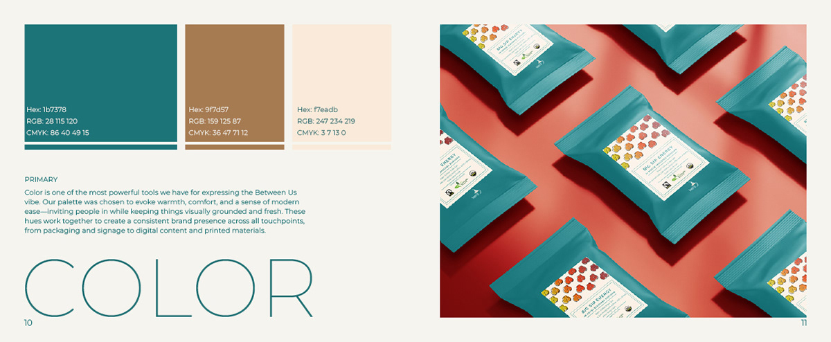
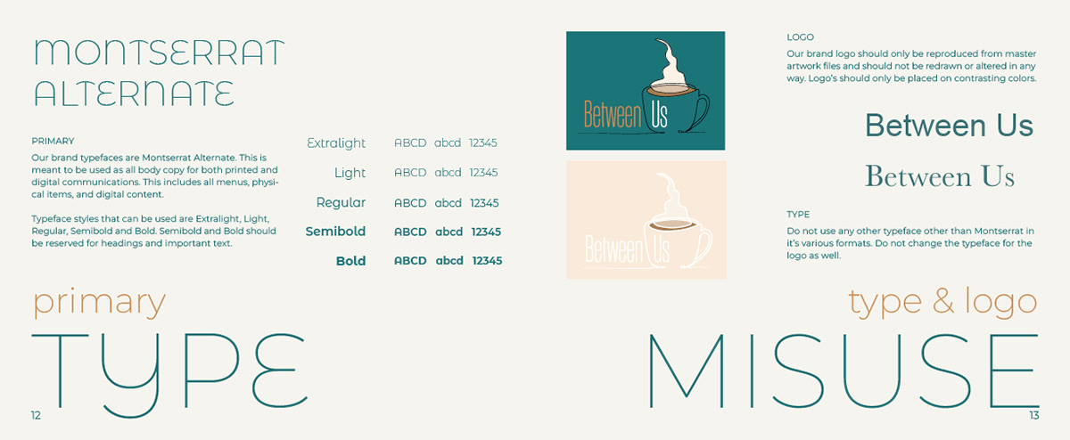
The brand’s palette and type system are designed to feel artisanal but approachable — earth-toned, with soft contrast and clean lines.
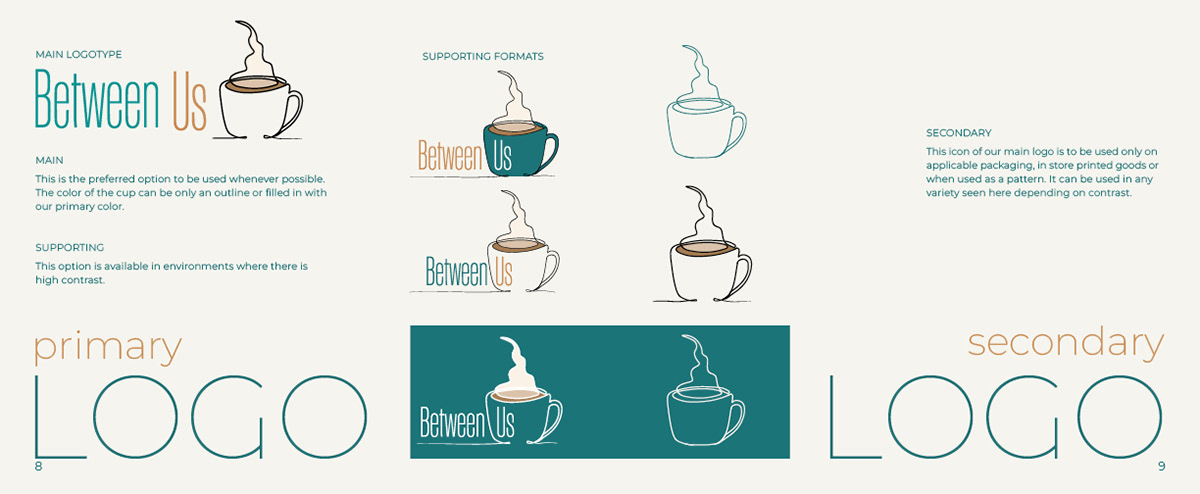
Logo Development
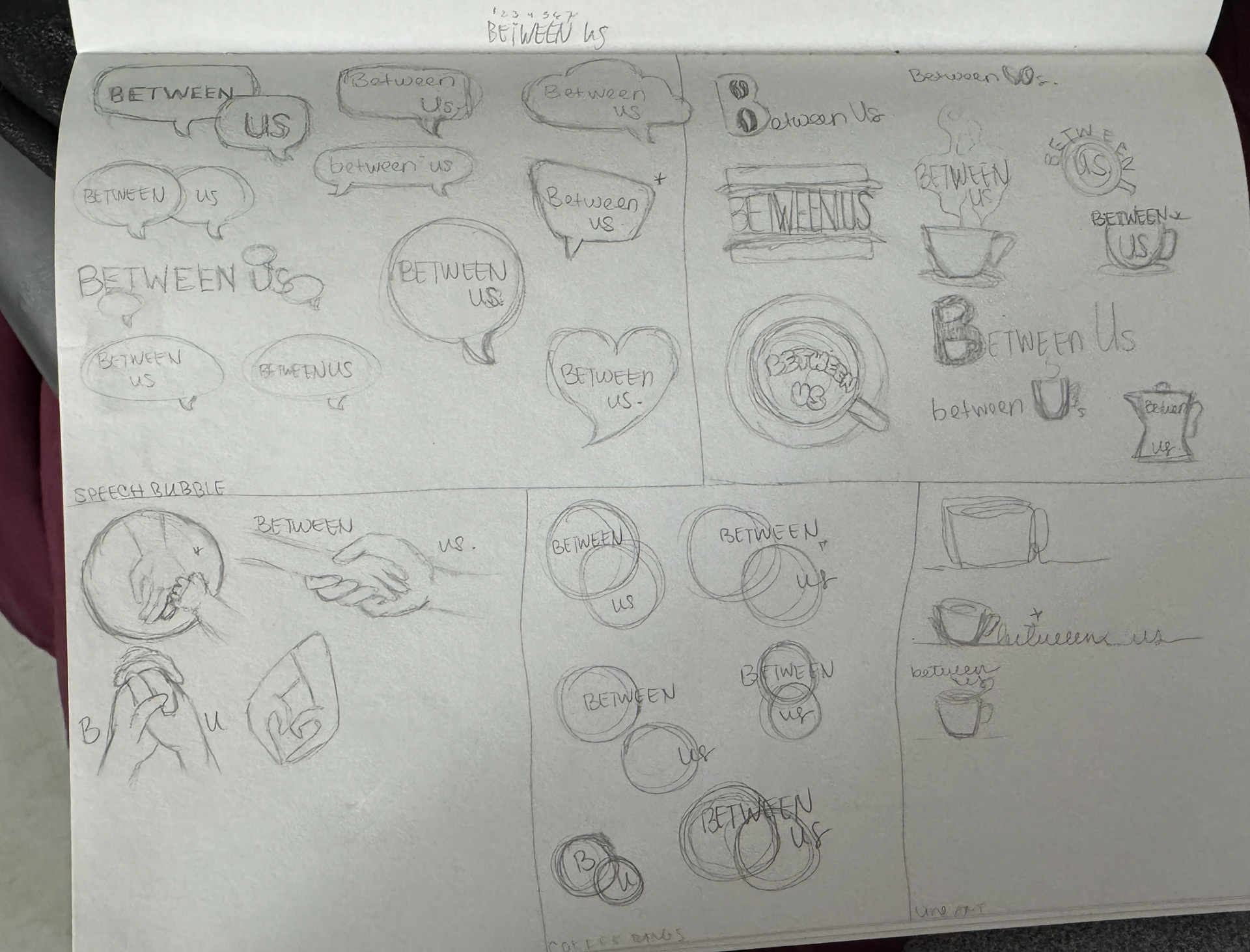
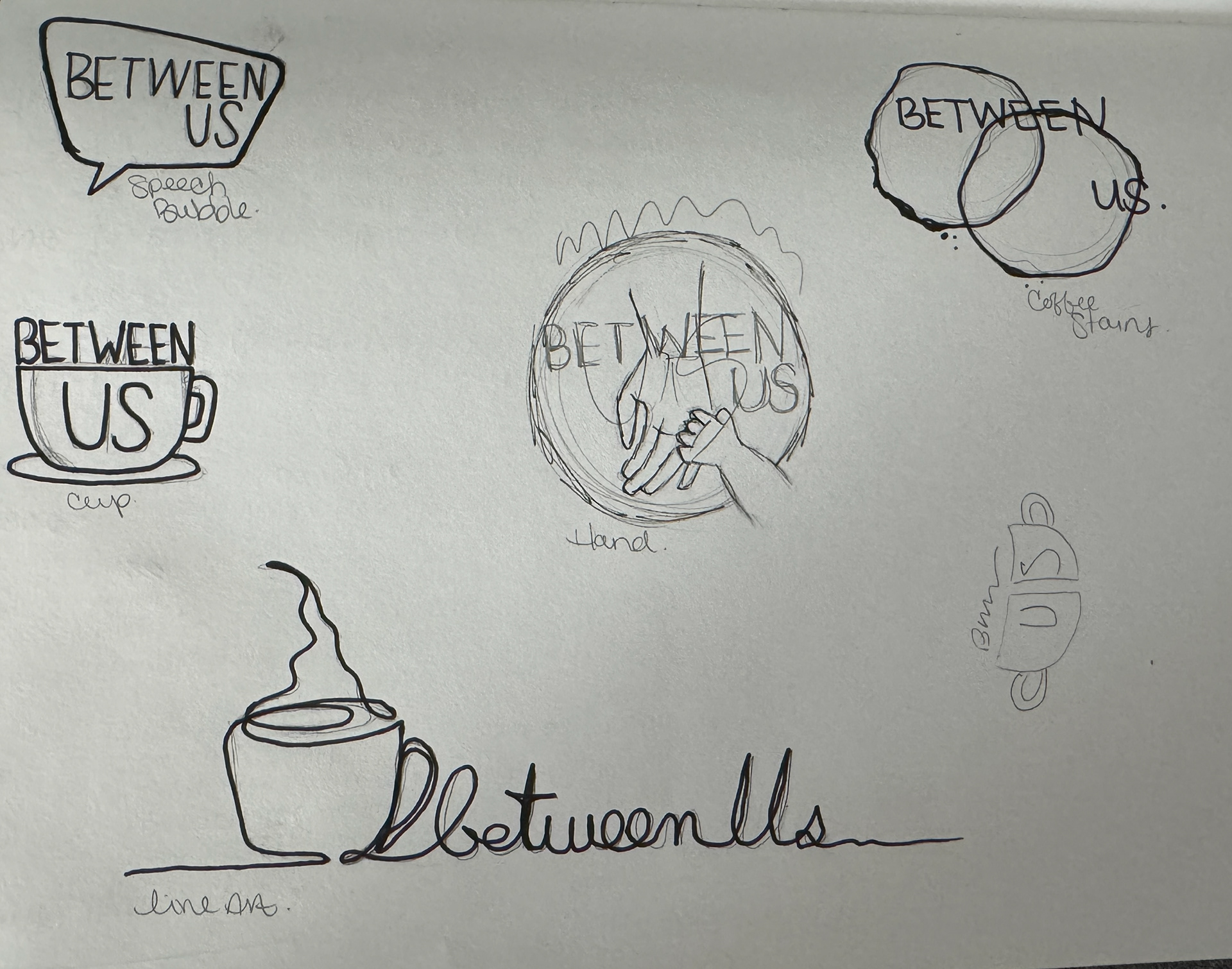
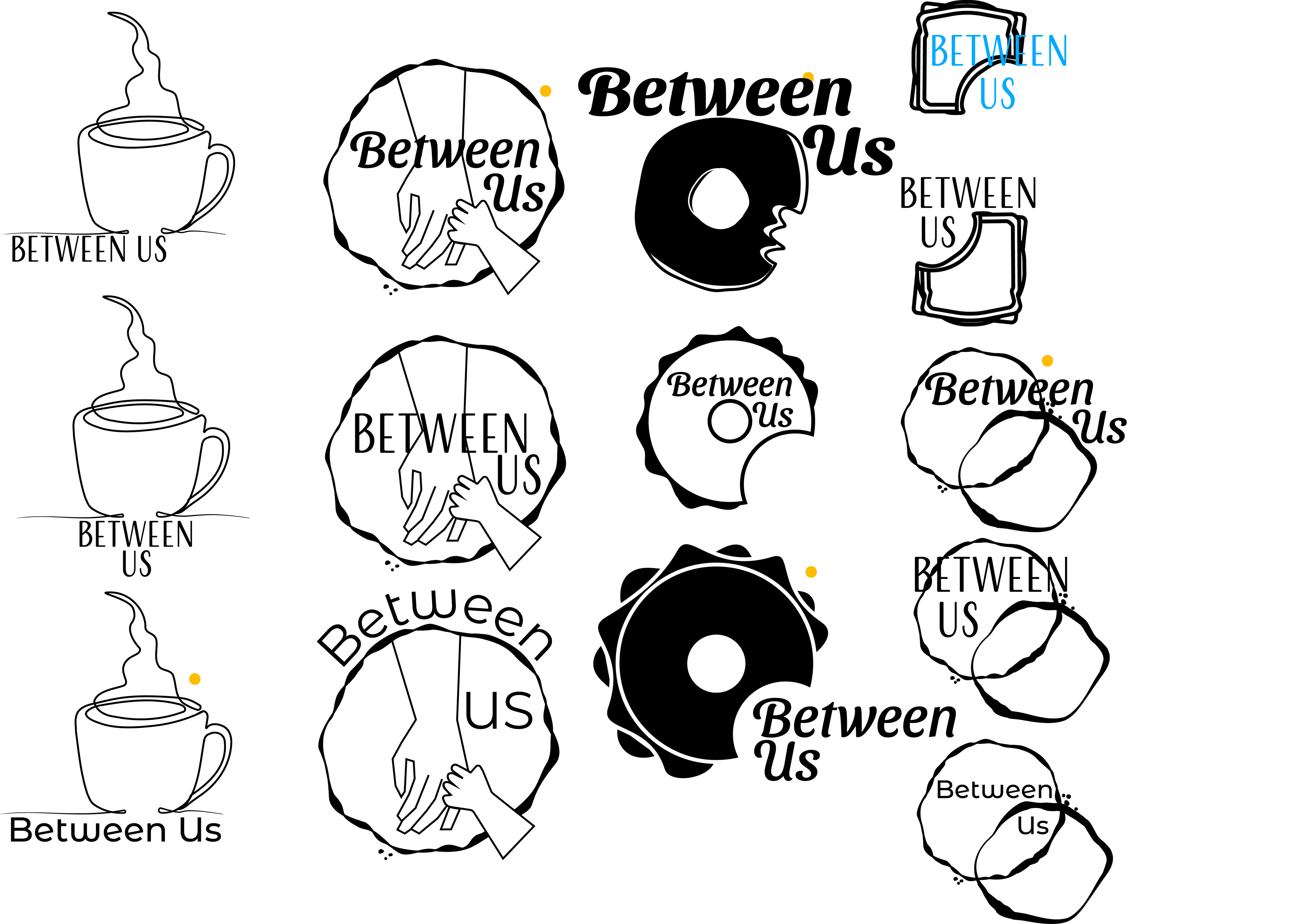
Logo development process for Between Us Café. Early concepts explored themes of warmth, connection, and circularity before evolving into the final mark — a simple, modern emblem with handcrafted character.
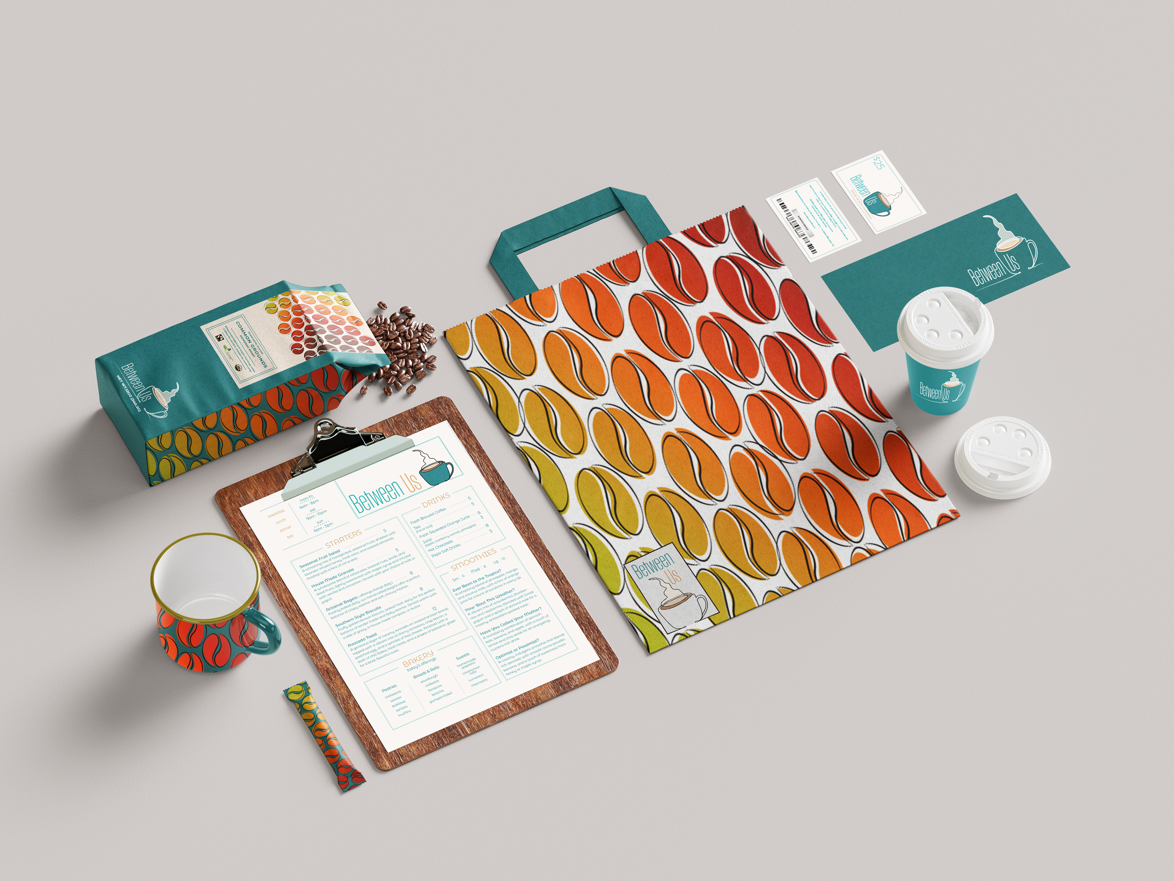
Print & Packaging
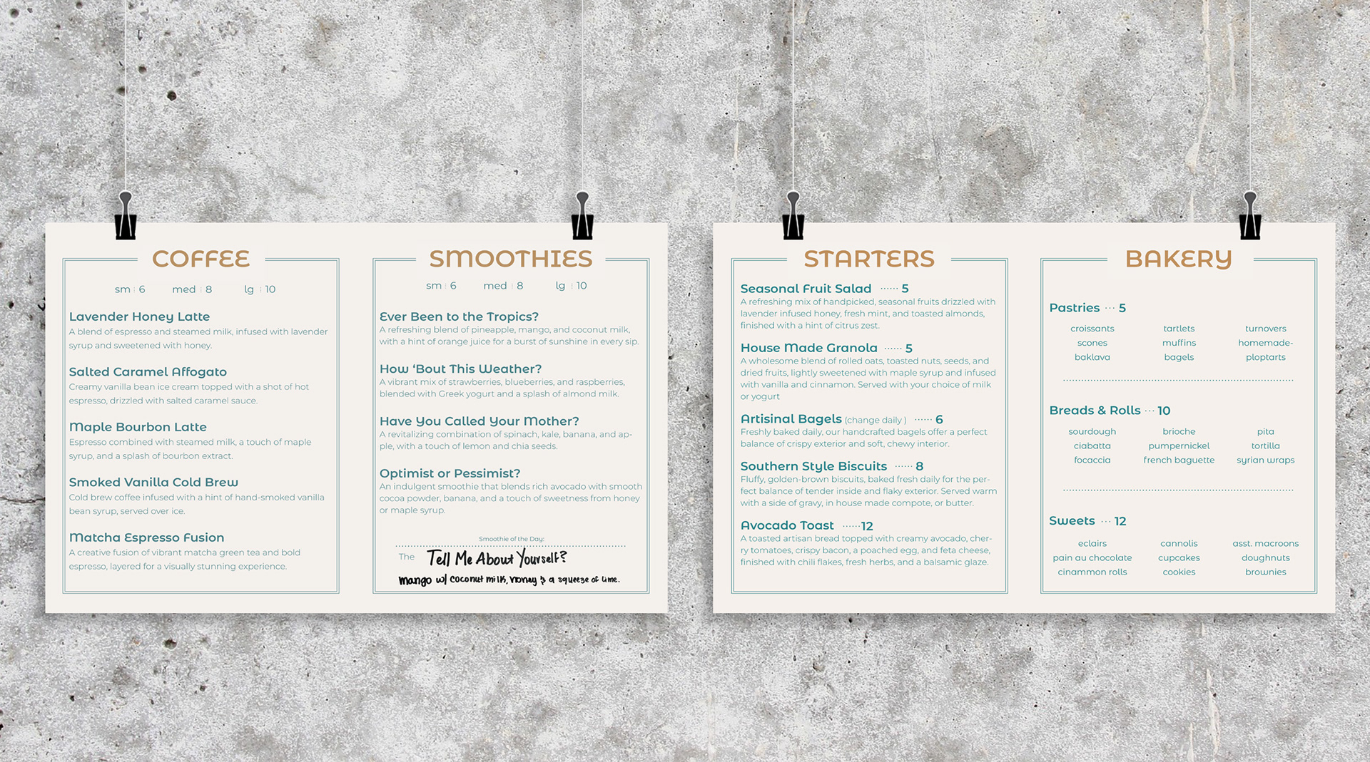
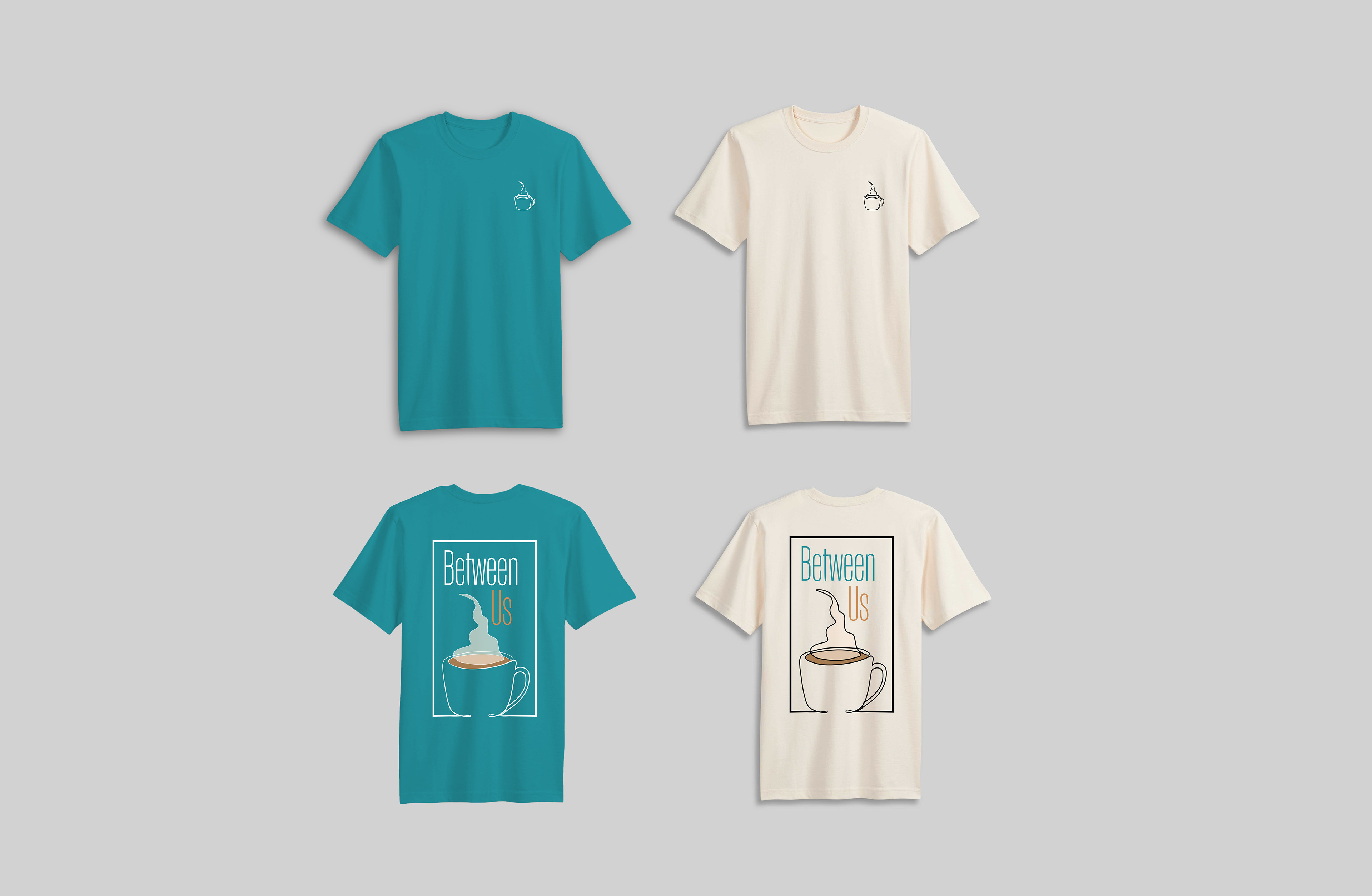
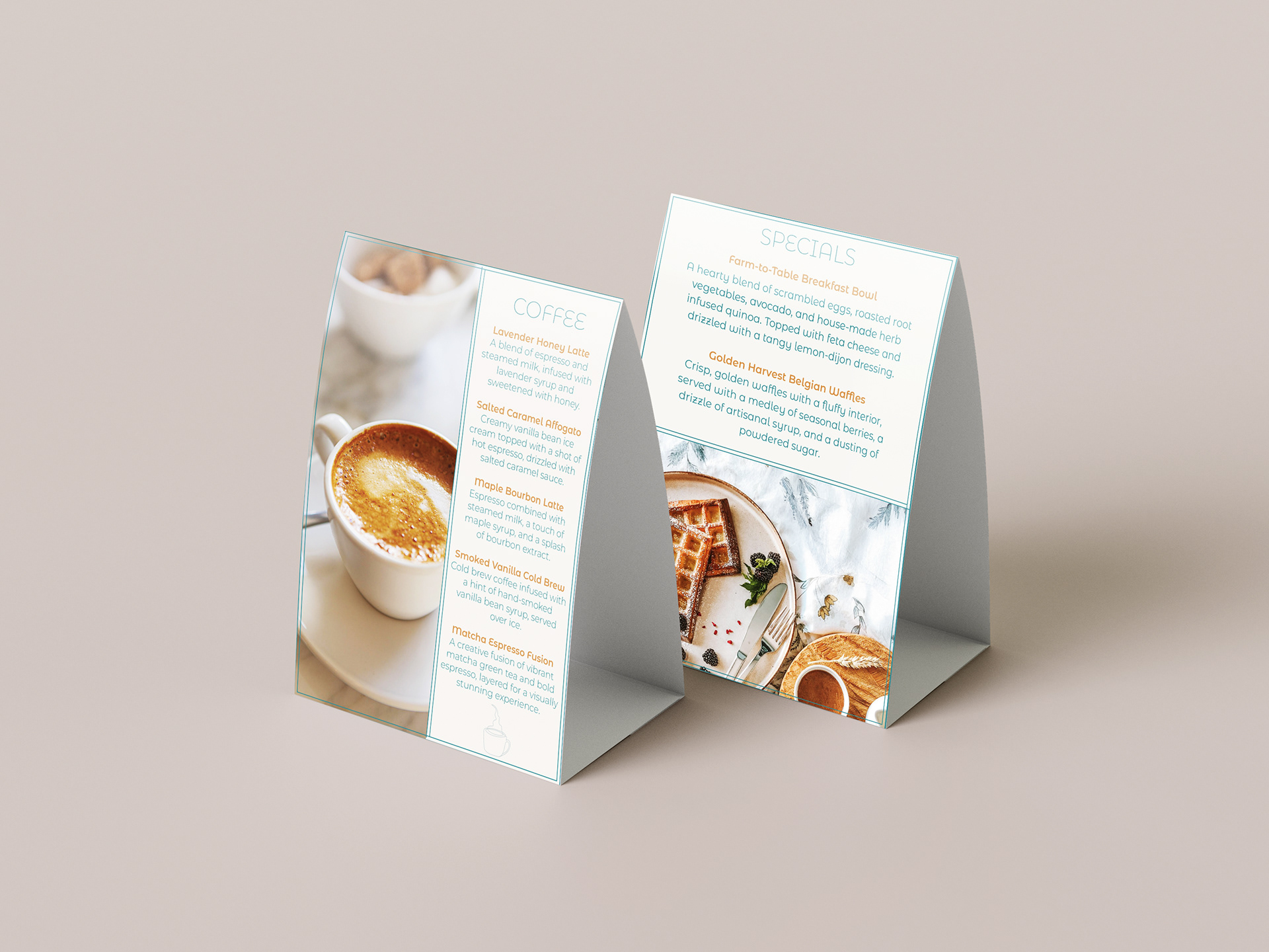
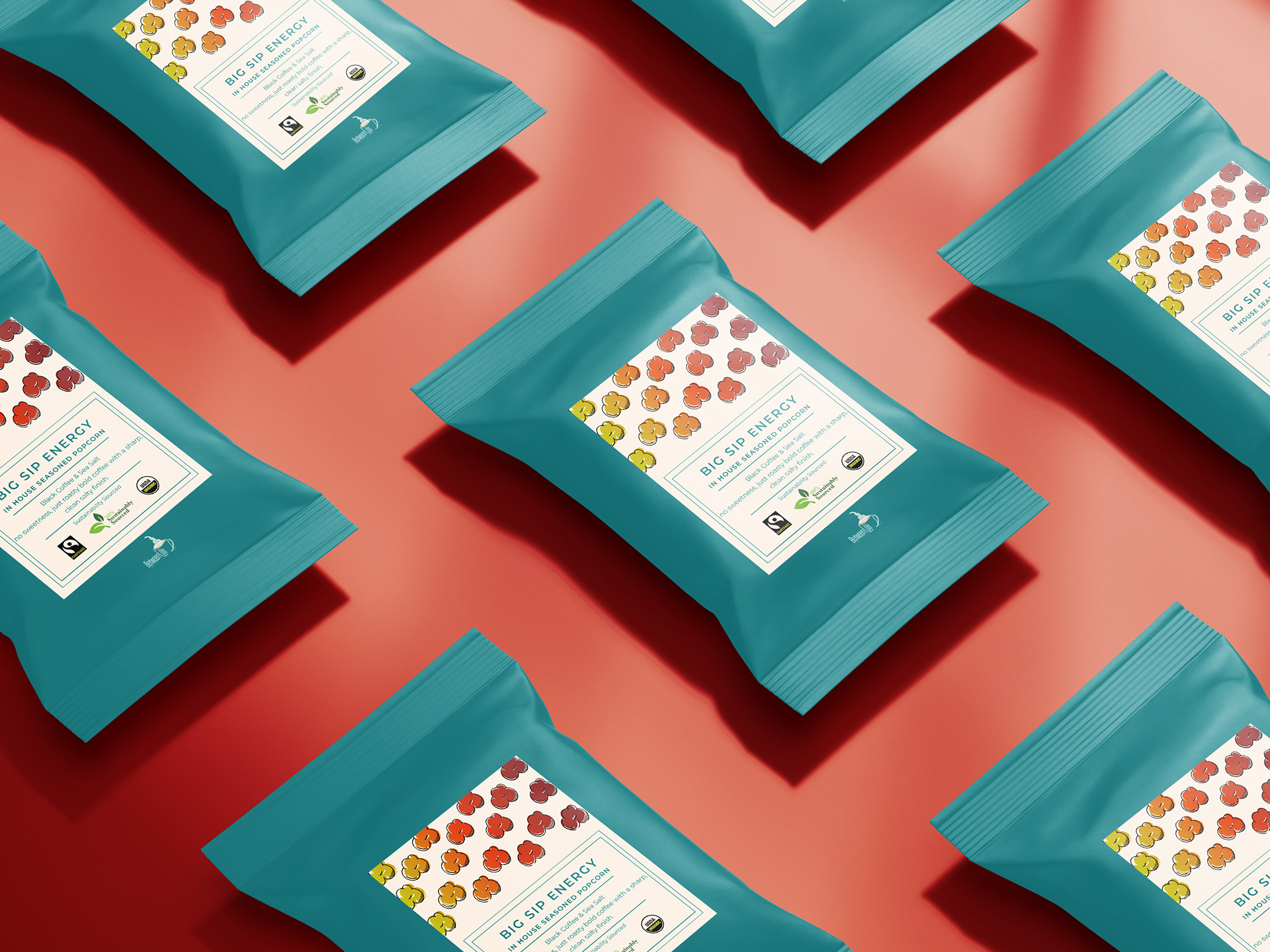
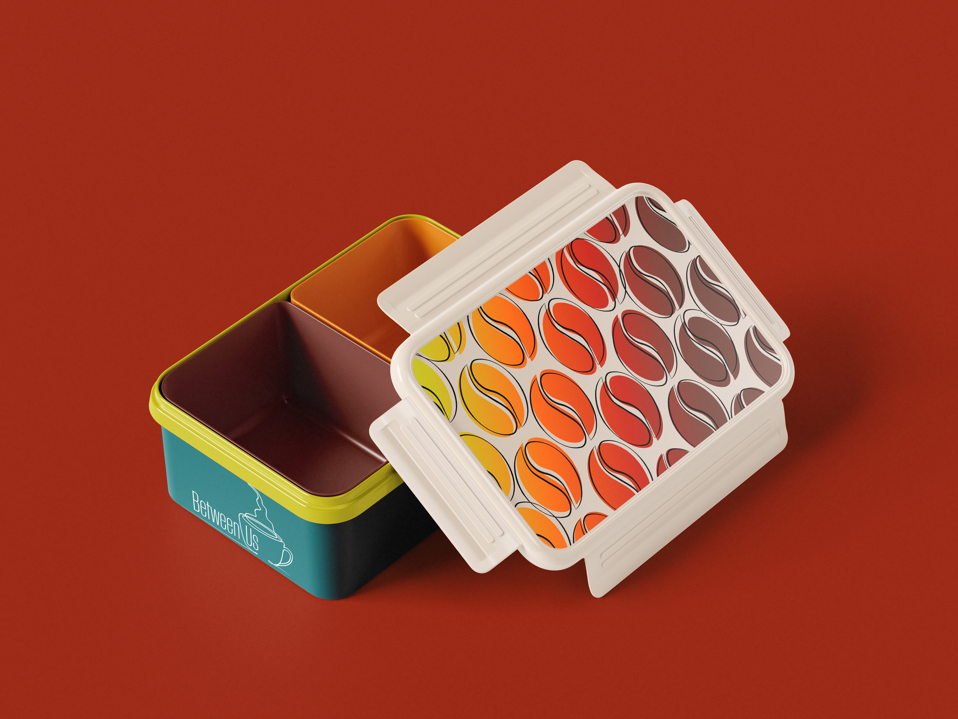
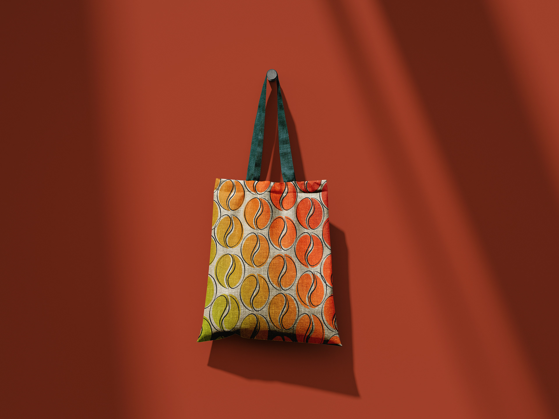
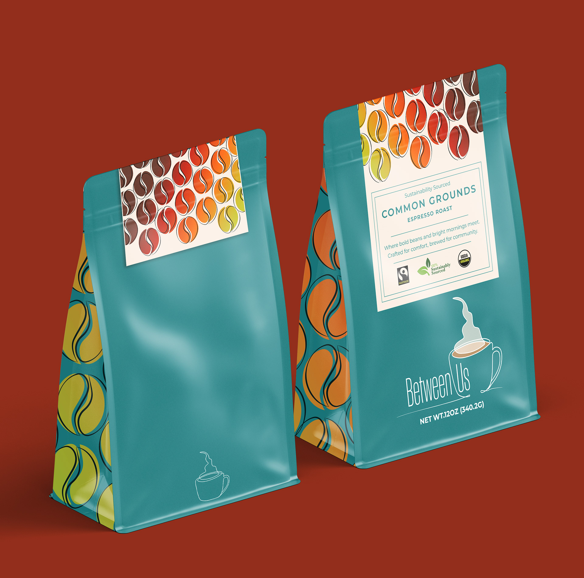
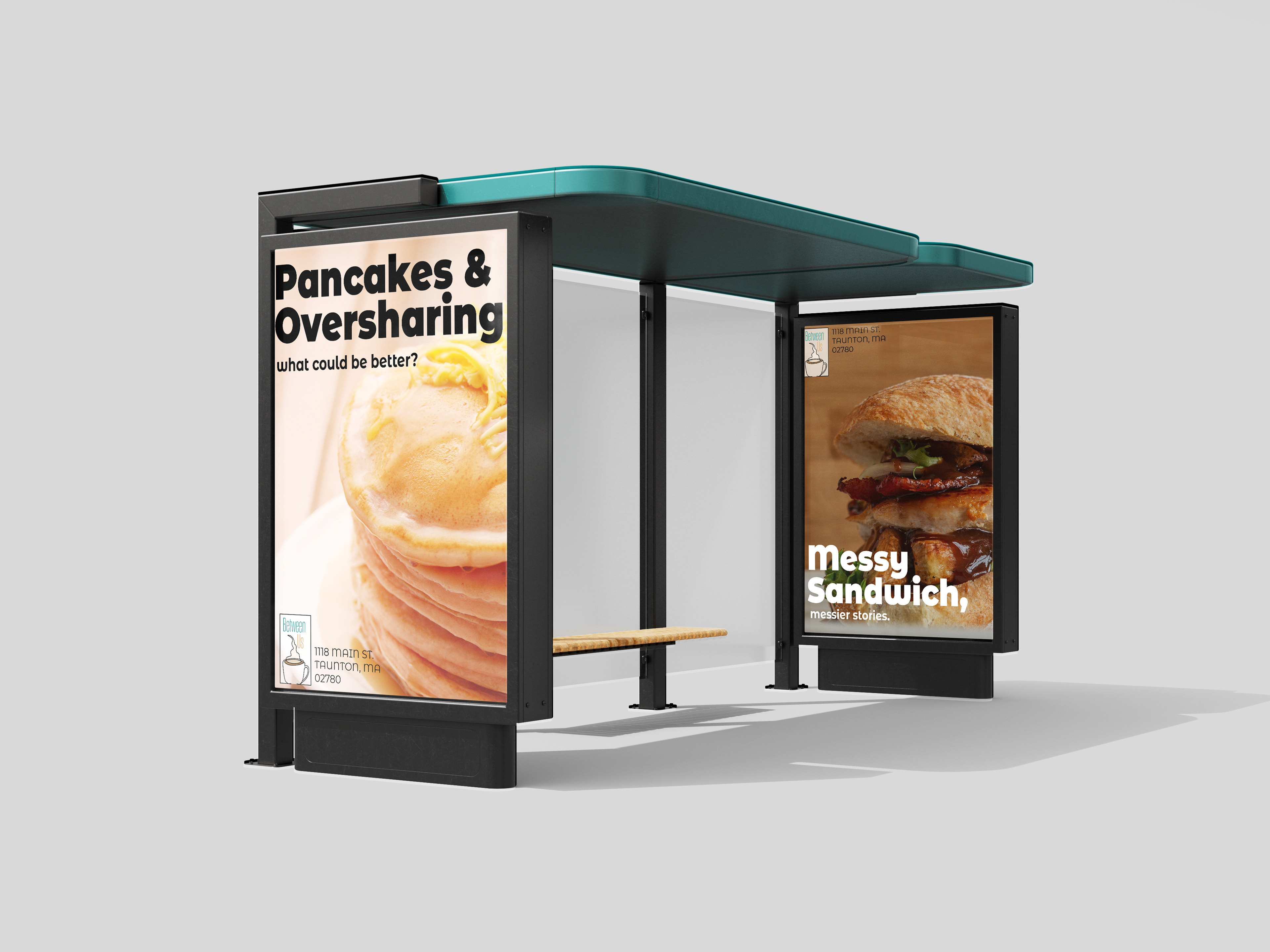
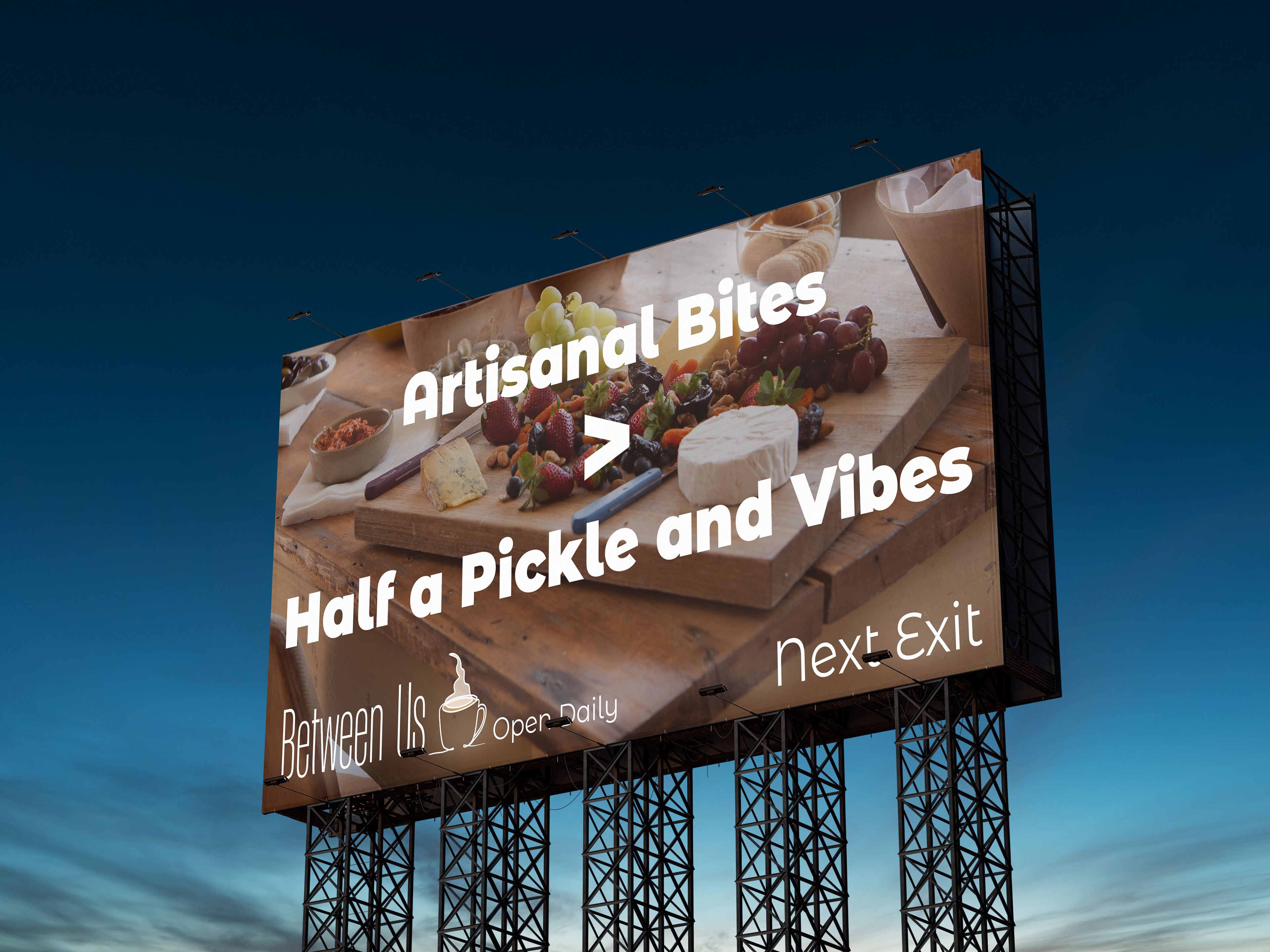
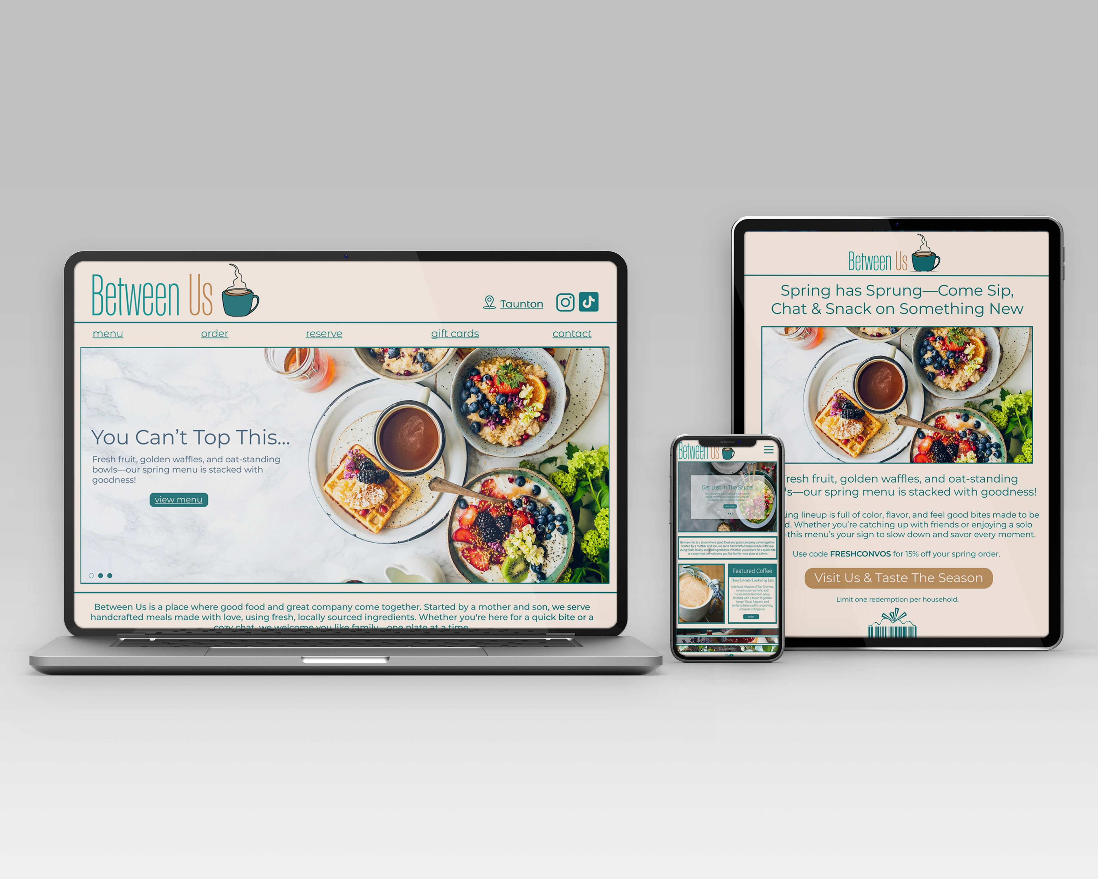
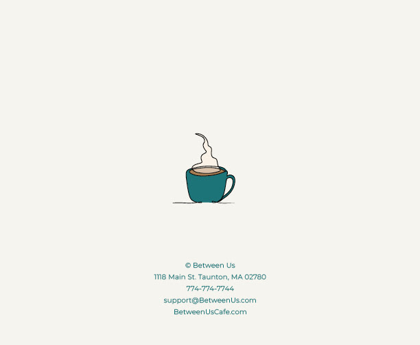
Packaging, print, and digital applications of the Between Us brand — designed to create a cohesive, welcoming experience across every customer touchpoint.
This was one of my most rewarding and challenging projects. It pushed me to build not just a brand, but a feeling — something that resonated personally and visually. Inspired by my own son’s dream of owning a café one day, Between Us is a love letter to connection, community, and good design that brings people closer together.